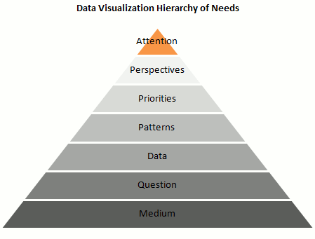
Is it possible to create a “data visualization hierarchy of needs” like Maslow’s hierarchy of human needs? I’ve tried that in the pyramid above. Here are the details:
- Is it the right Medium? A chart can really help processing data and minimize information overload, but what about “chart overload”? Don’t make a chart if you don’t need one, and make sure that a chart is the best vehicle for your message.
- Answer a Question: Let’s assume that you do need a chart. A chart is (should be…) a visual answer to a very specific question. What is the question? Try to use is as the chart title: does the chart still make sense? Make sure you chose the right data to answer the question.
- Present the Data accurately: A chart is a visual translation of an underlying data table. This translation shouldn’t distort proportions and relationships between data points.
- Emphasize the Patterns: The whole point of presenting the data visually is to take advantage of our built-in pattern detectors, but you must help them. Choose the right chart type. Don’t display the data randomly. For example, don’t sort a categorical variable alphabetically (that’s almost random). The sorting key should be the data itself.
- Establish Priorities: Create layers of reading. Grid lines are less important than the data, so they should be grayed out. Some series are leading actors, other series provide context.
- Multiply Perspectives: Add detail, create multiple views of the same dataset, add interaction.
- Grab Attention: Add color, make your chart aesthetically pleasing.
What do you think? Am I missing something? What would you change? Add your comments below.
______________________
Want to create better dashboards? Try the Excel Dashboard Tutorial.
Post from: Excel Charts Blog.
Data Visualization Hierarchy of Needs
![]()
You may also be interested in:
Tidak ada komentar:
Posting Komentar